
Let’s talk gallery walls—the quickest way to make a room feel intentional and lived-in. But a few tiny missteps can throw the whole vibe off. I’m walking you through seven complete room designs that dodge the most common gallery wall traps, so you can steal the look and avoid the headache.
1. The Parisian Parlor: Avoiding the “Floating Island” Wall
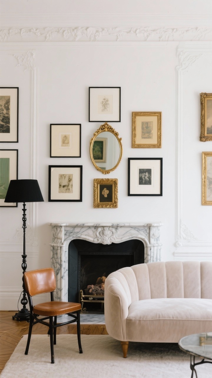
In this elegant living room, we’re channeling a soft Parisian palette—chalky white walls, a pale mushroom velvet sofa, and a vintage marble fireplace. The gallery wall sits above the mantle, but here’s the trick: it doesn’t float awkwardly in the middle of the wall.
We keep the lowest frames just 6–8 inches above the mantle and stack upward with layered sizes. A gilded convex mirror anchors the center, flanked by slim black frames and a few antique gilt pieces for depth. The furniture reinforces the vertical line with a petite bistro chair in caramel leather and a black iron floor lamp that echoes the frame color.
- Mistake to avoid: Hanging art too high so it “floats.”
- Do this instead: Keep the grouping connected to the furniture line and build up.
- Color notes: Black, cream, warm gold, and soft gray-greens in the art.
2. The Modern Coastal Den: Ditching Matchy-Matchy Frames
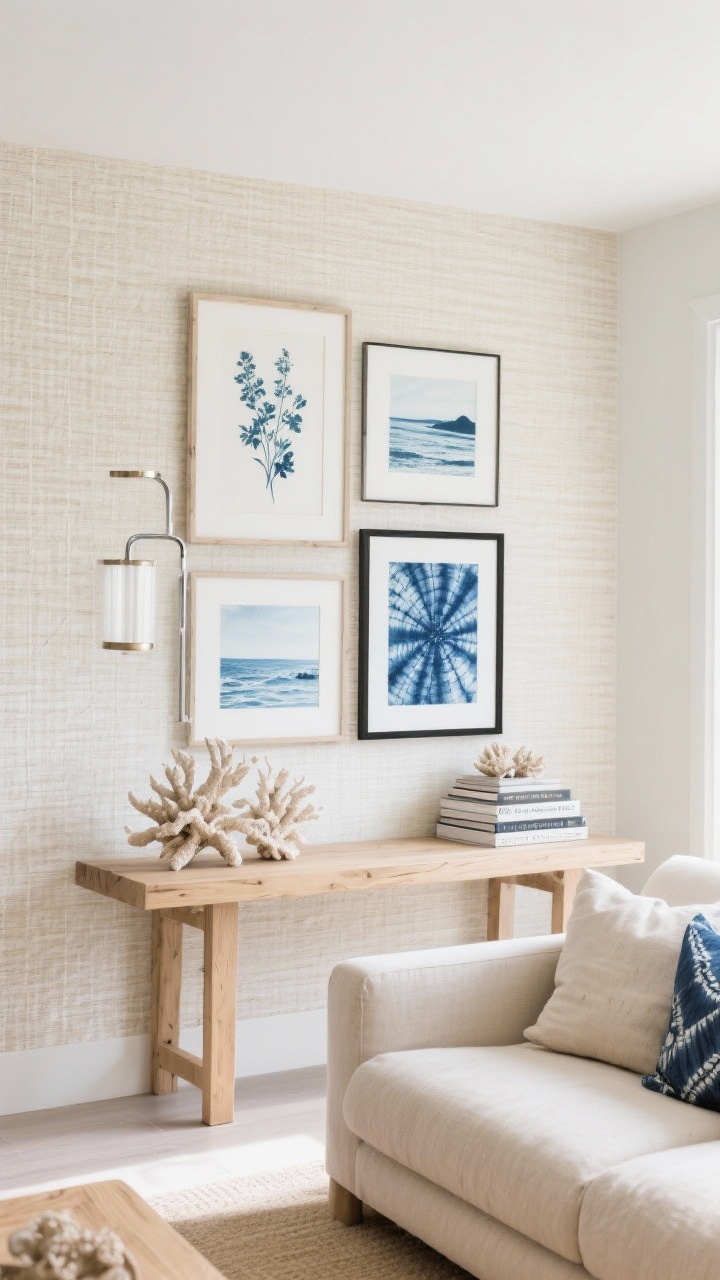
This cozy den feels like fresh sea air—bleached oak console, woven grasscloth wallpaper in pale sand, and a low linen sectional in oatmeal. The gallery stretches above the console, but we skip the “one-frame-fits-all” look.
Instead, we mix whitewashed wood frames with brushed nickel and matte black, keeping a steady rhythm by repeating each finish at least twice. The art moves from botanical cyanotypes to soft sea landscapes, and we drop in one unexpected textile: a framed piece of indigo shibori. The console is styled with coral sculptures and a stack of coastal photography books to tie it all together.
- Mistake to avoid: Identical frames that flatten the look.
- Do this instead: Mix 2–3 finishes, repeat each, and keep art tones cohesive.
- Texture wins: One textile or dimensional piece to break up the glass.
3. The Moody Library: Not Measuring Equals Visual Chaos
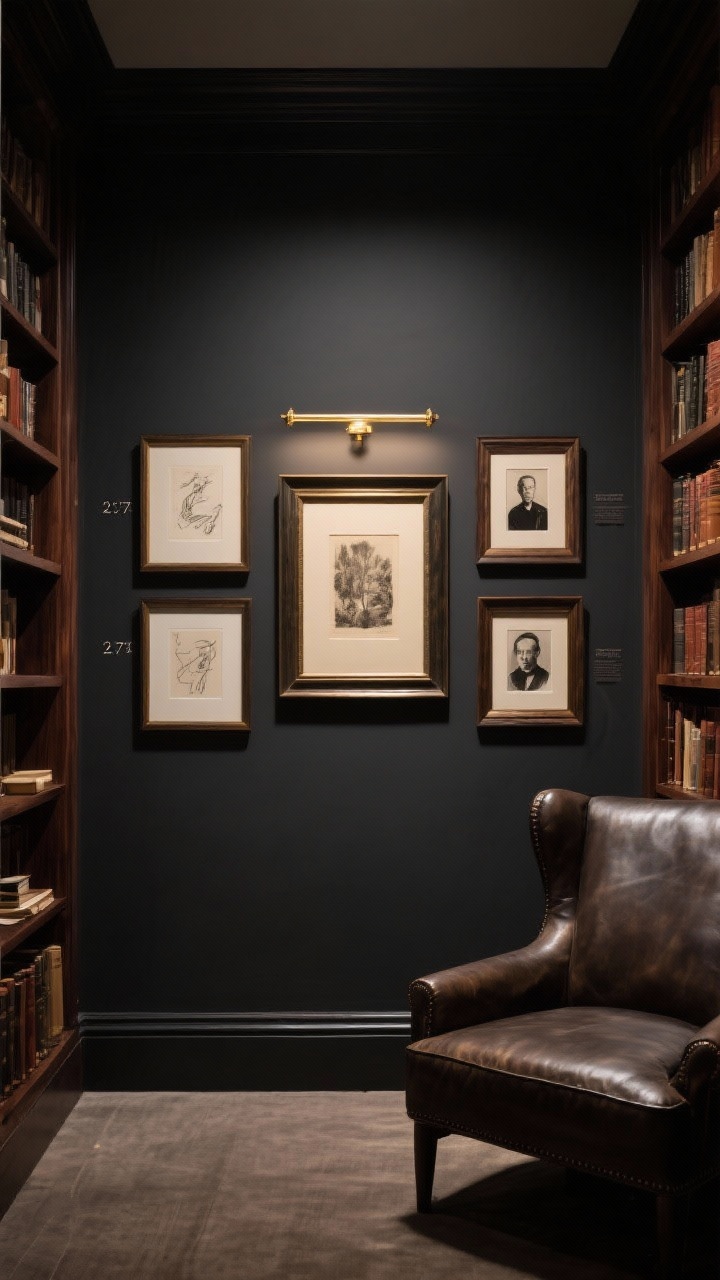
Think cozy and dramatic: charcoal walls, walnut bookcases, and a leather club chair that looks like it’s already read your favorite novel. The gallery climbs between two tall shelves, but every piece is measured like a grid you can’t see.
We use 2-inch spacing consistently between frames, even when the sizes vary. The layout starts centered at eye level (about 57 inches to the middle of the central piece) and radiates out. Frames are deep wood and oil-rubbed bronze; the art skews sepia, ink sketches, and black-and-white portraits. A brass picture light crowns the center for that museum glow.
- Mistake to avoid: Eyeballing gaps and ending up with uneven spacing.
- Do this instead: Commit to a uniform gap (2 inches is magic) and a true centerline.
- Lighting: One linear brass light or two mini sconce accents.
4. The Scandinavian Dining Room: Skipping a Cohesive Color Story
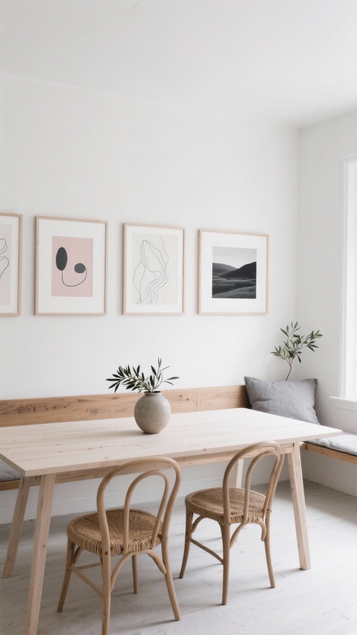
Here we go quiet and airy—soft white walls, a pale ash dining table, and wishbone chairs with natural cord seats. The gallery stretches horizontally along the main wall, and every piece sings the same calm palette.
Artwork stays in graphite, blush, and dove gray, with line drawings, delicate abstracts, and a single charcoal landscape for contrast. Frames are pale wood and white, keeping the vibe serene. A narrow oak bench below anchors the spread, topped with a gray linen cushion and a ceramic vase of olive branches.
- Mistake to avoid: A color free-for-all that clashes at dinner.
- Do this instead: Choose 2–3 art hues and repeat them across different mediums.
- Pro tip: Keep mats light and consistent for Scandinavian calm.
5. The Eclectic Entryway: Forgetting About Scale and Negative Space
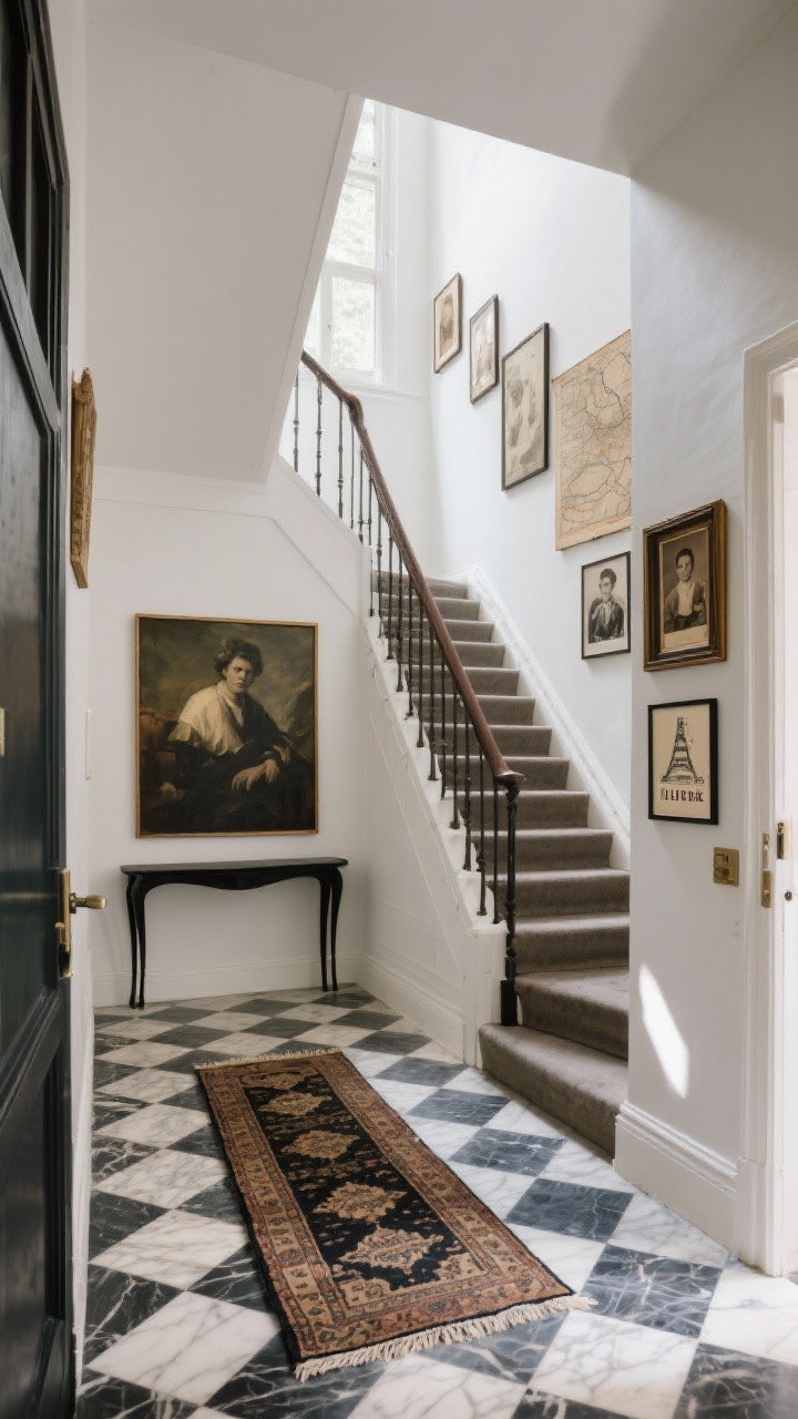
This entry is your home’s handshake—a checkerboard marble floor, a vintage runner, and a slim black console. The gallery wall climbs the stairwell, and scale is the secret sauce.
We anchor the base with one large, moody painting, then stair-step upward with medium and small frames that echo the angle of the stairs. Negative space is intentional: the cluster never touches the banister line, and we leave a clean border around the outer edges so it feels curated, not jammed. The art? A world traveler’s mix—old maps, family photos in sepia, and a framed ticket stub from a Paris trip.
- Mistake to avoid: Filling every inch and losing the breath between pieces.
- Do this instead: Use one oversized anchor and keep a consistent margin around the layout.
- Layout cue: Follow the staircase angle with staggered heights.
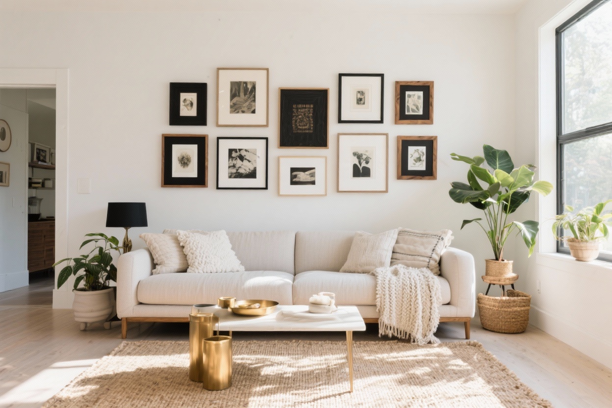
6. The Minimalist Loft: Ignoring Furniture Alignment
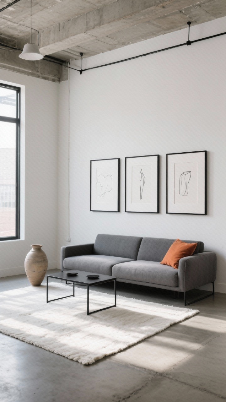
Picture a sunlit loft with concrete floors, a low-profile slate sofa, and a generous ivory rug. The gallery sits behind the sofa, and instead of floating aimlessly, it aligns with the furniture like it was designed together.
We keep the lowest frames 7–10 inches above the sofa back and match the gallery’s width to the sofa’s length for balance. The art is minimal—three large pieces with generous white mats and black frames, plus two slender line drawings to soften the edges. A black steel coffee table and a ceramic floor vase echo the monochrome palette, while a single terracotta throw pillow is the warm punctuation.
- Mistake to avoid: A gallery that’s too narrow or too wide for the furniture below.
- Do this instead: Align the overall gallery width with the sofa or console.
- Keep it clean: Fewer, larger pieces with ample matting.
7. The Boho Bedroom: Forgetting Depth and Dimension
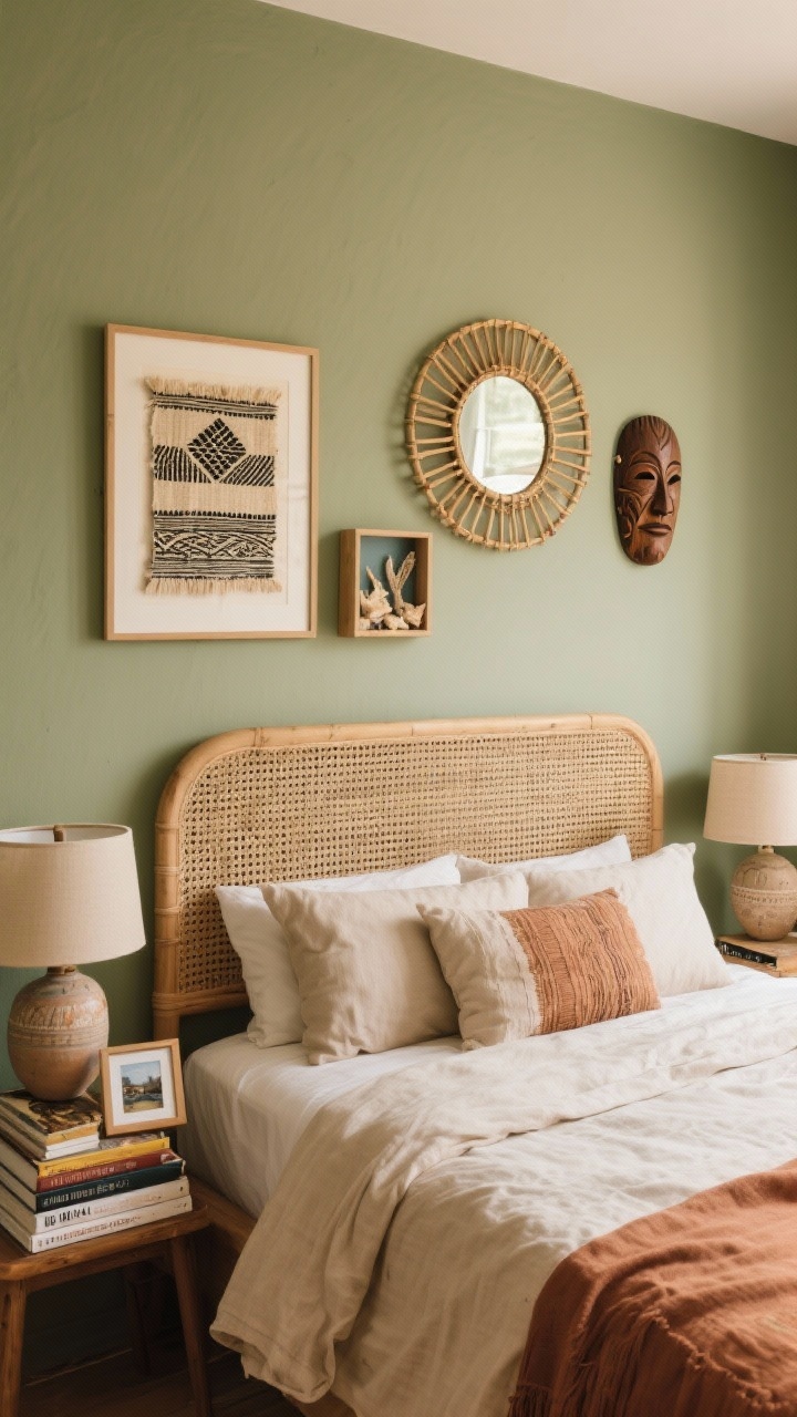
We’re going layered and relaxed—sage walls, a rattan headboard, and linen bedding in sand and clay. Instead of a flat gallery above the bed, we create a mixed-depth moment with dimension and texture.
Start with two framed textiles—perhaps a block print and a woven fragment—then add a round bamboo mirror off-center for movement. Introduce a small shadowbox holding beach finds, plus a hand-carved wooden mask to break up the grid. The nightstands mirror the look with ceramic lamps, stacked travel books, and a tiny framed photo leaning casually.
- Mistake to avoid: All flat glass frames that feel one-note.
- Do this instead: Add mirrors, shadowboxes, textiles, and sculptural pieces for depth.
- Balance: Keep the arrangement low and wide so it doesn’t overwhelm the headboard.
A polished gallery wall isn’t just about the art—it’s about scale, spacing, color, and connection to the furniture and room. Pick your favorite vibe above, steal the structure, and your walls will feel custom, intentional, and so you.